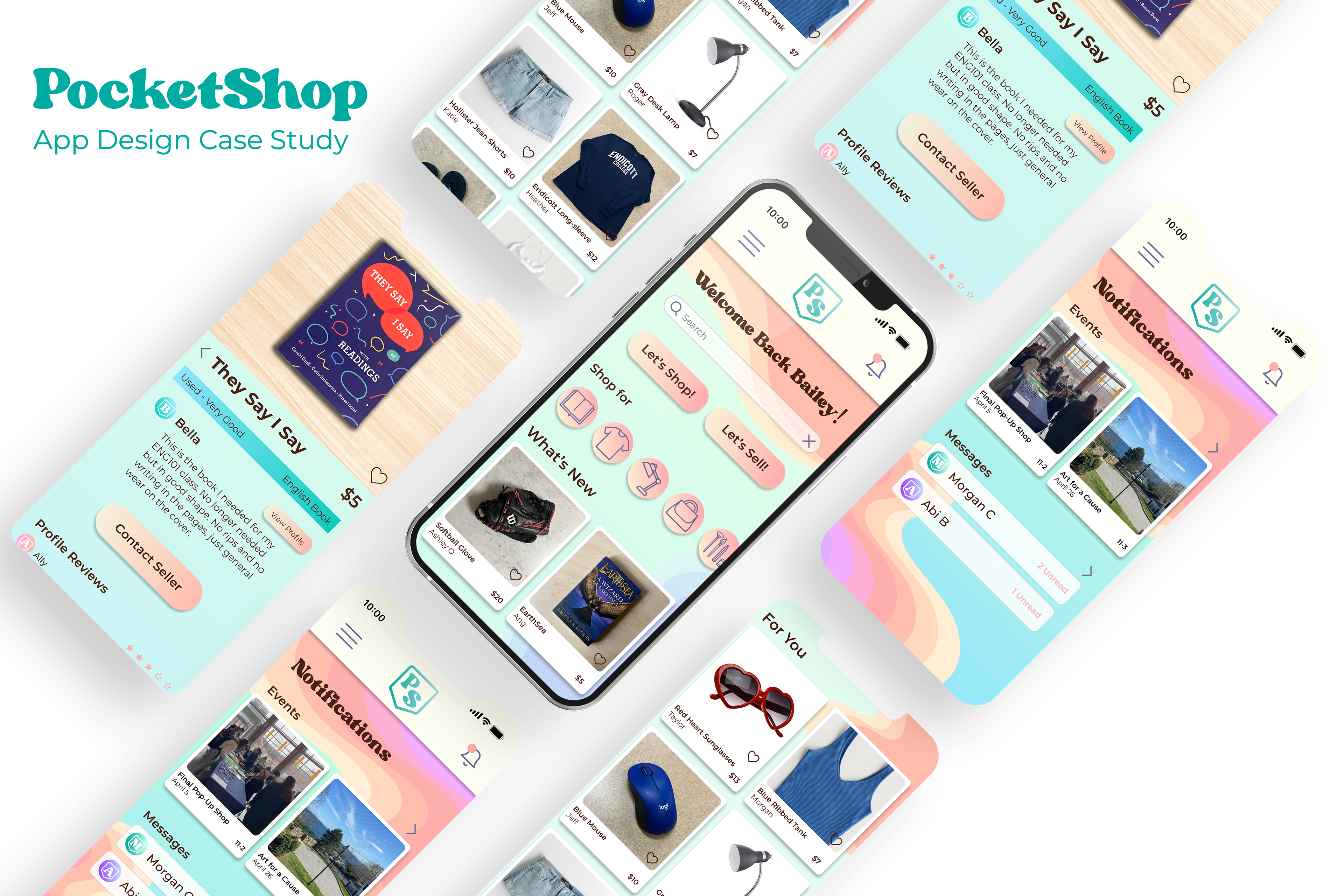
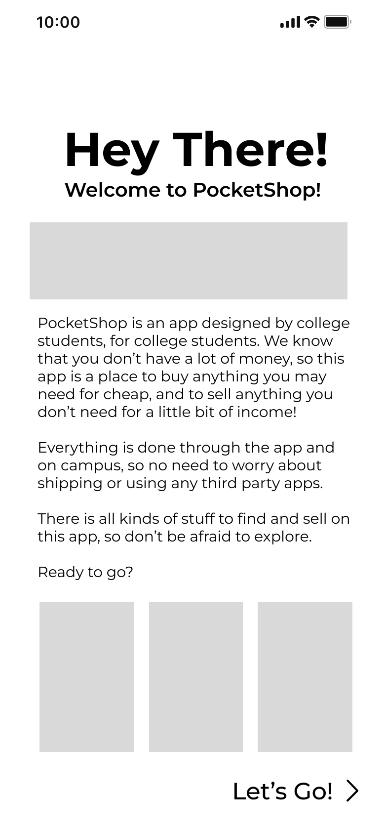
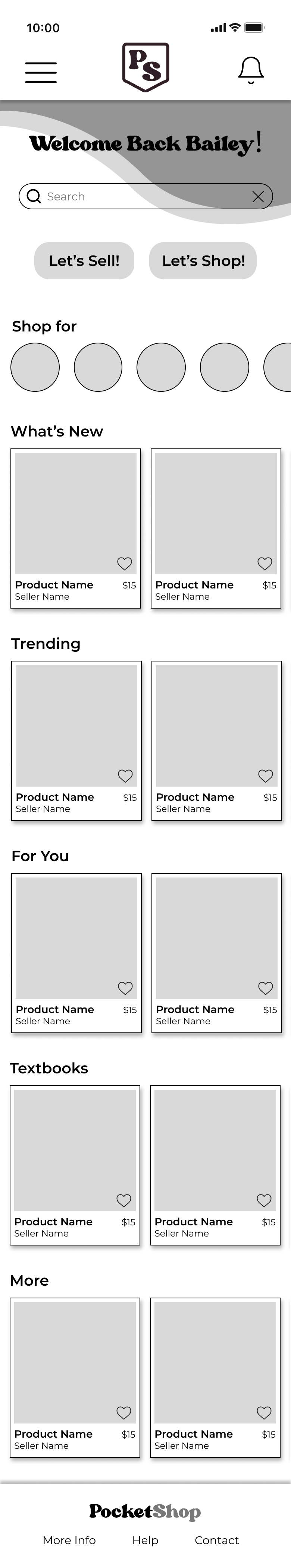
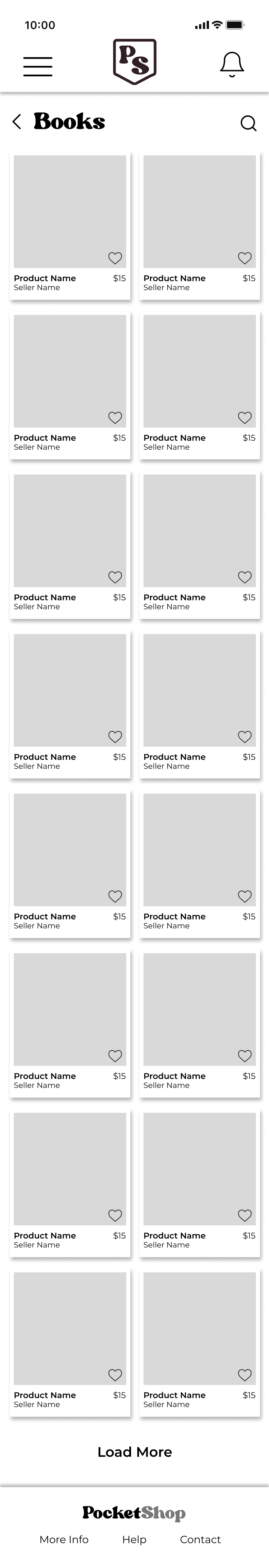
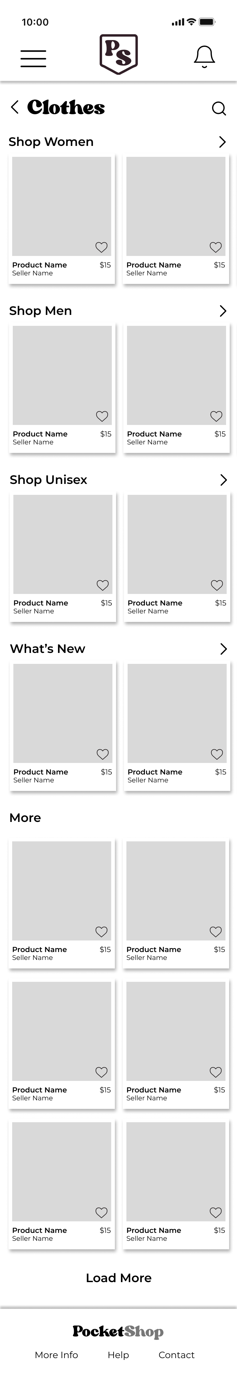
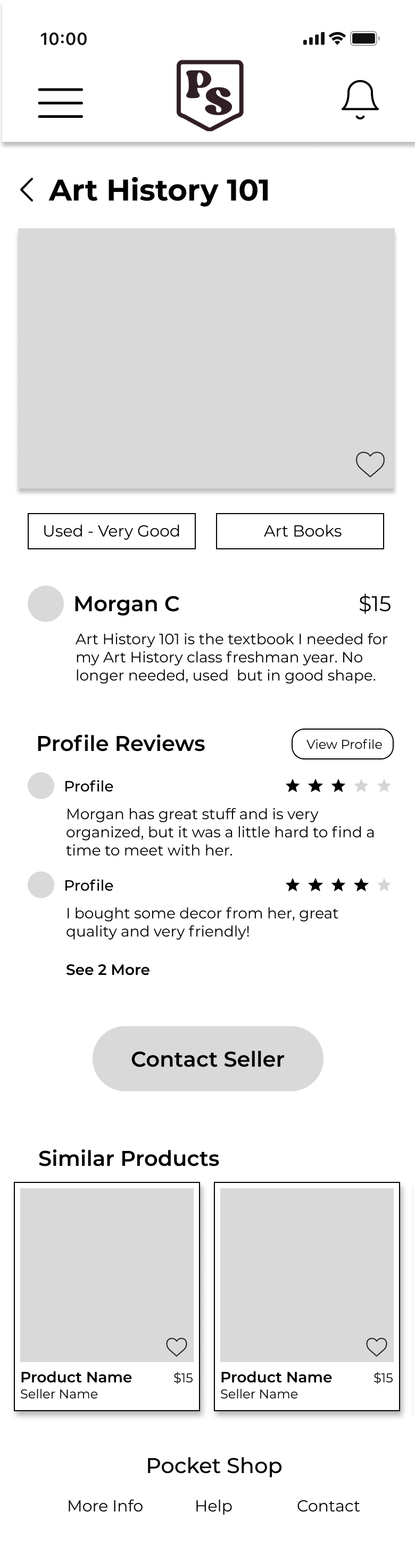
PocketShop is an app that allows college students to buy and sell products on their college campus, all entirely through the app.
Problem: College students have no money, and little to no source of income
Solution: An app that gives students a place to buy things that they need for a cheap price, as well as sell anything that they don't to get some money
Timeline: January-May 2023

Survey Results
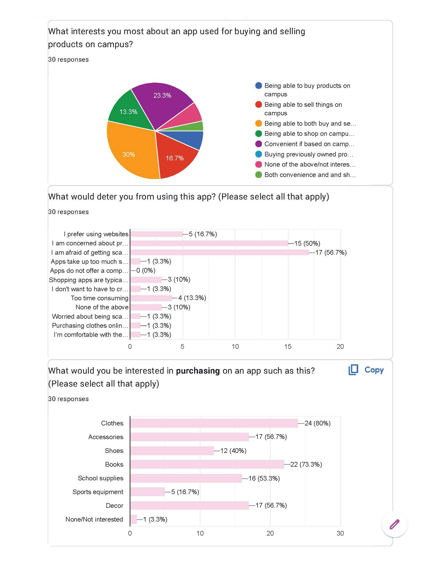
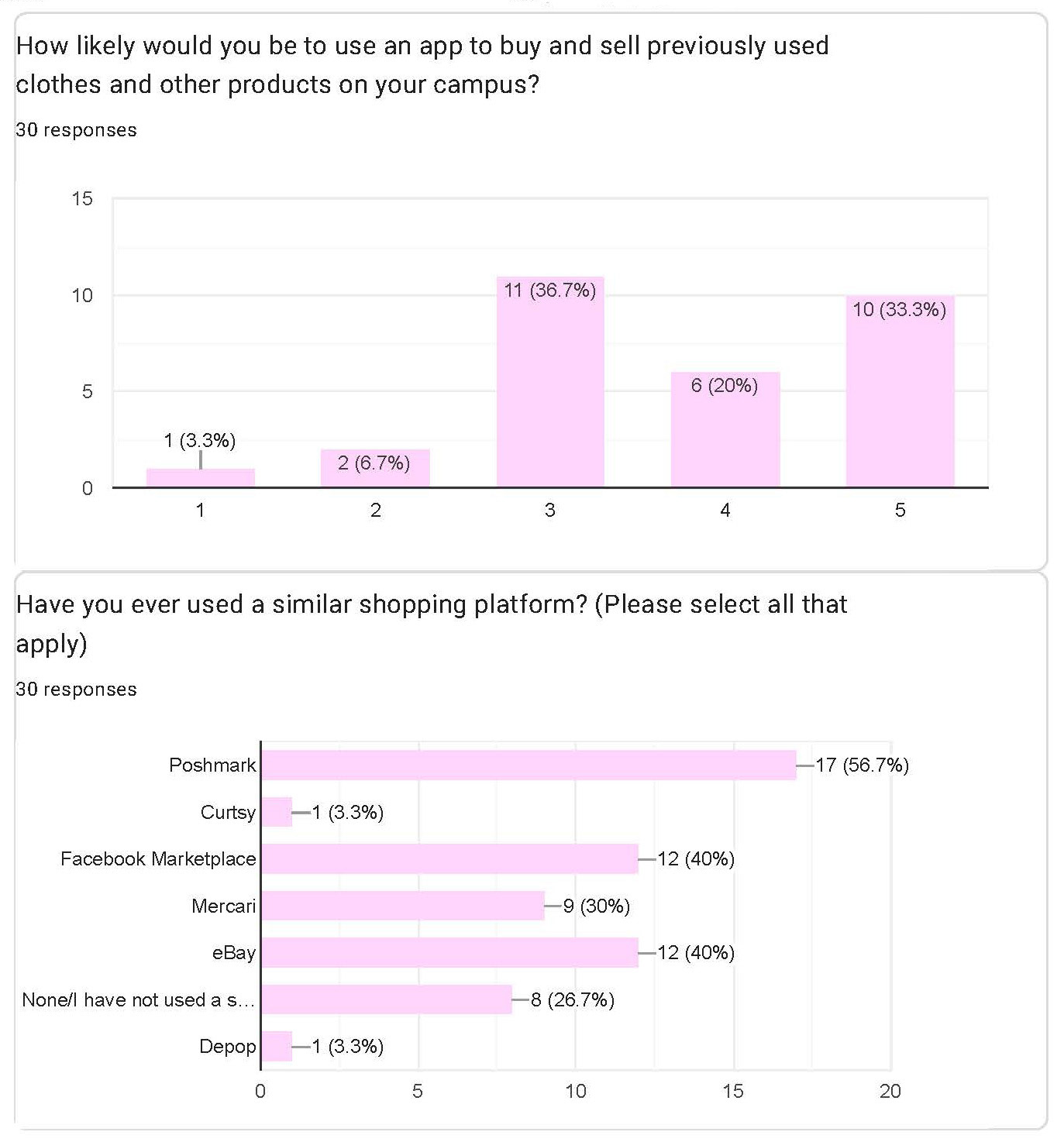
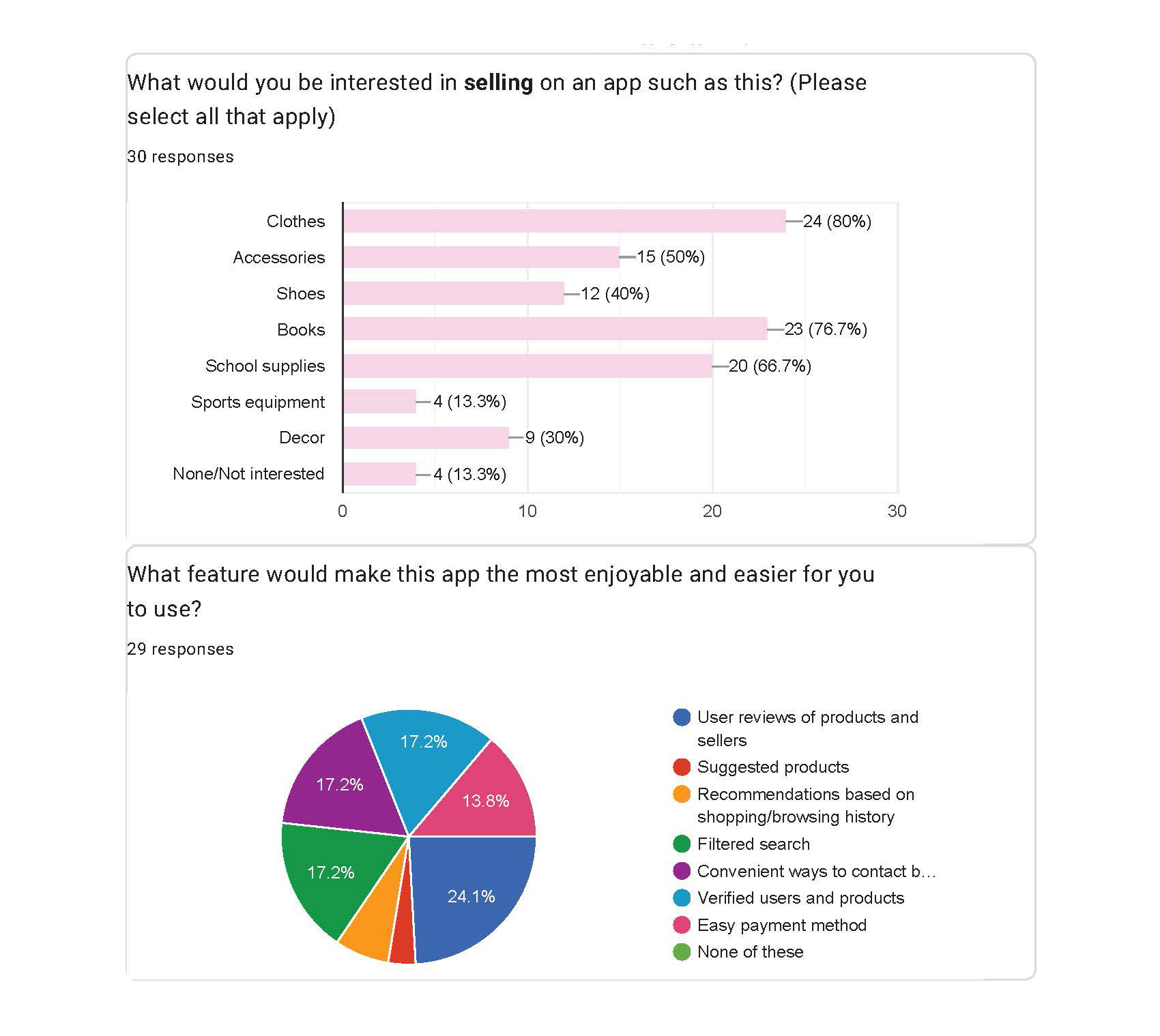
Before beginning this project, I conducted a survey to see how responsive my target audience would be to my idea.
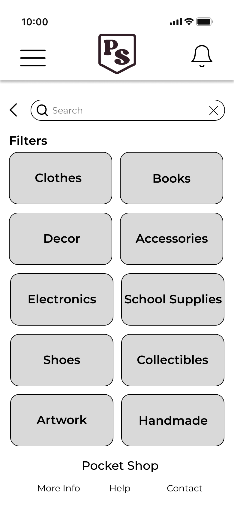
The survey showed that generally most people would be pretty interested in it. It also showed me what people would be most interested in buying or selling on the app, which helped me organize my content hierarchy

There are a lot of other ecommerce shopping apps out there, so I compared a few of the more well-known ones. I found that the majority of them had some basic UI principles, like a smart search feature and a main navigation bar, but I was surprised on how lacking some were, which gave me some ideas for what I wanted to include in my app.
User Journey
I created a user journey of how I thought that my ideal user would move through the app completing the task that I thought was the main user journey: purchasing something on the app.
Through this I could conceptualize how my user would move through these steps, which pages they would see, which issues and questions they would have, and figure out how they could complete the task in the best way possible.
User Persona
While I created a user journey, I developed a persona of my ideal user.
I created a user persona based on my target audience and the results of my survey. My persona became a college student interested in trifting who needed to buy books on campus, but also liked to just shop second hand products. She would also be interested in selling some of her own things to get a little extra money as she, like much of my audience, does not have a job.


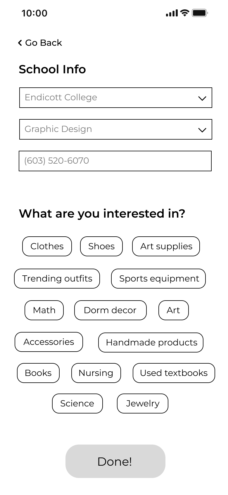
Once I had a basic idea of what I wanted to include in my app, I began white-boarding the basic screens of my app.
I blocked out where all the main information would go, and how the user would interact with the app and move through it. This white-boarding helped me to organize my content and visualize what it would look like.
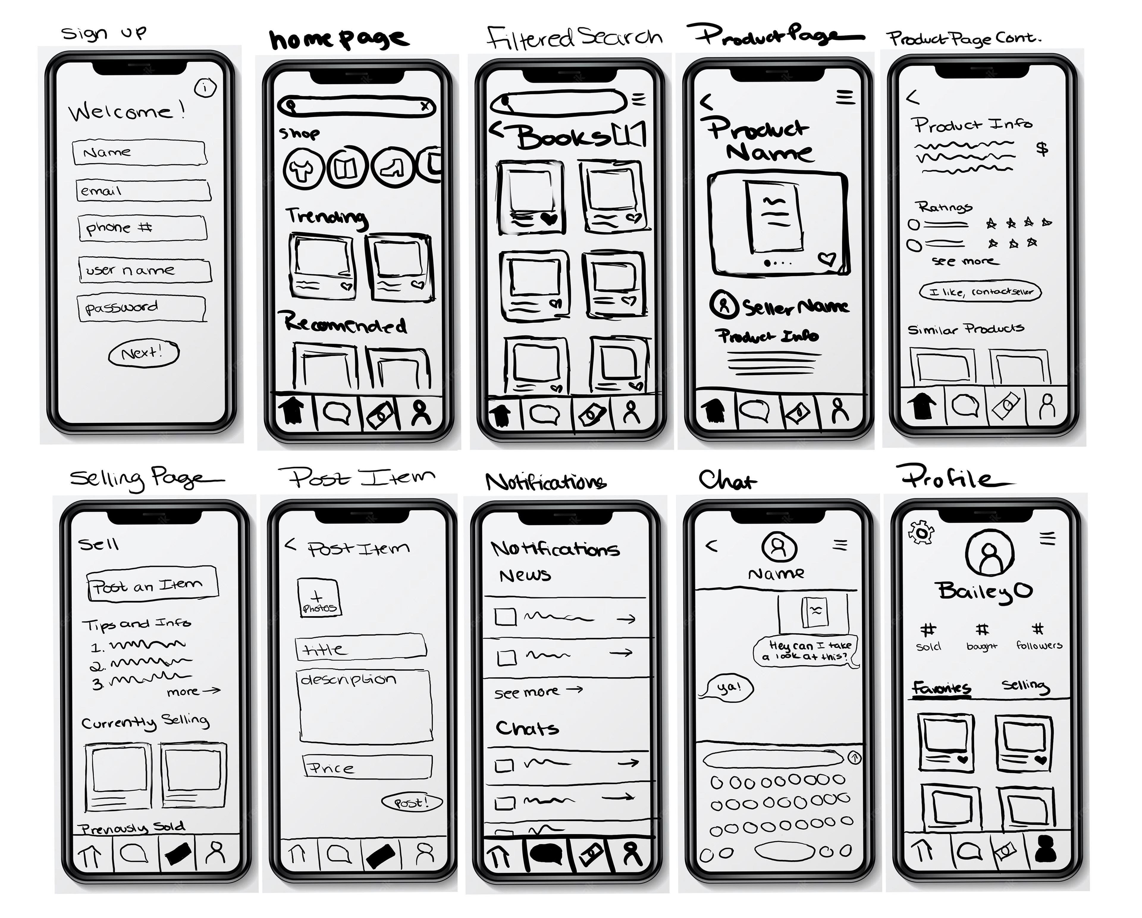
With the help of the user journey and persona I created, as well as my white boarded screens. I built out a wireframe of of my app.


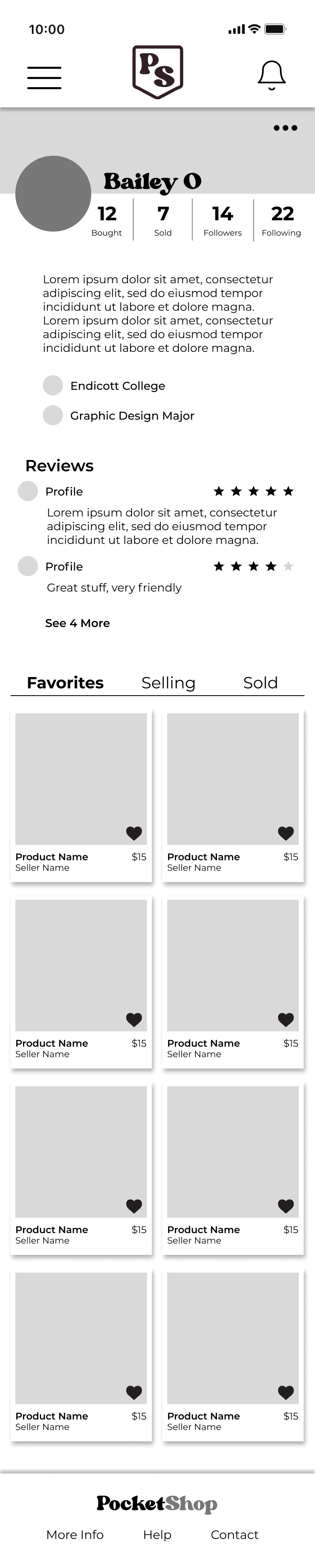

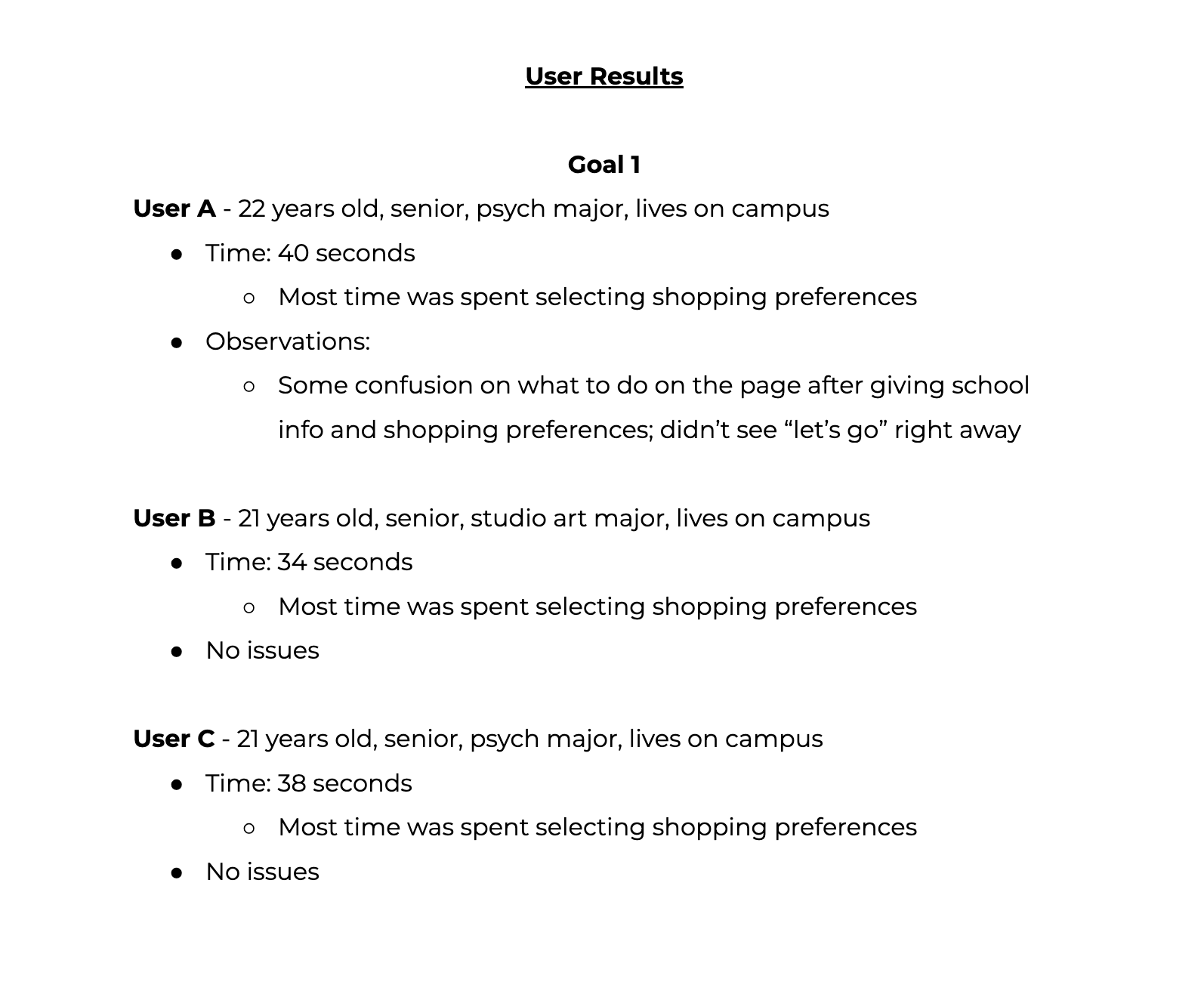
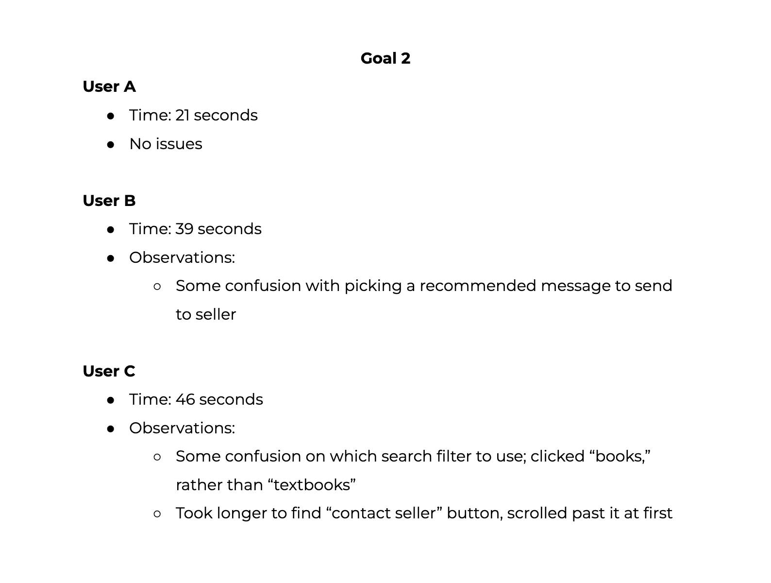
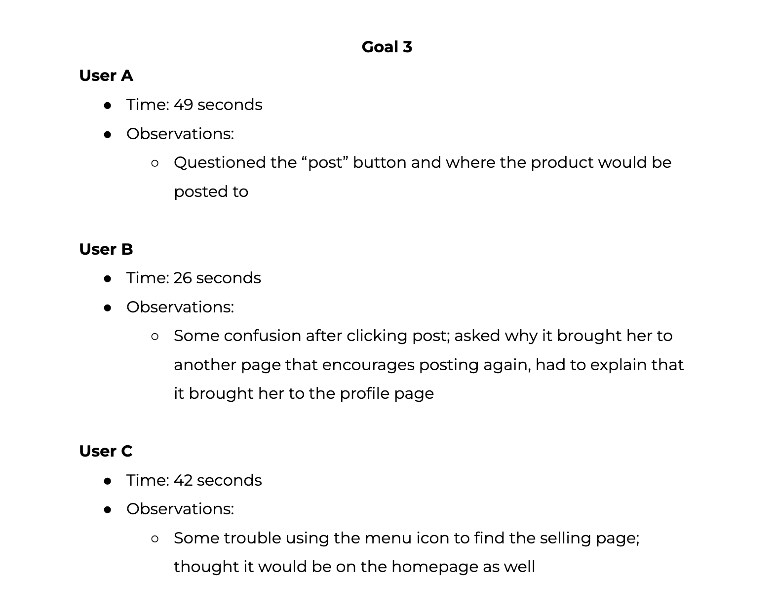
I prototyped the wireframes and conducted some user testing to see how easily my target audience would be able to navigate my app.
I looked for problem spots, places where they got stuck or confused, as well as things that interested them and what they looked for in the app. I made sure to ask a lot of questions, like what they thought worked well or could have been improved upon, and any things they would have liked to see that wasn't there.
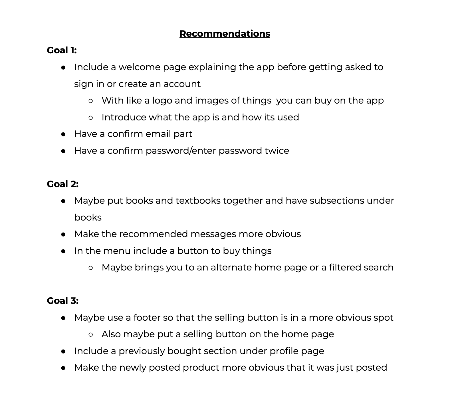
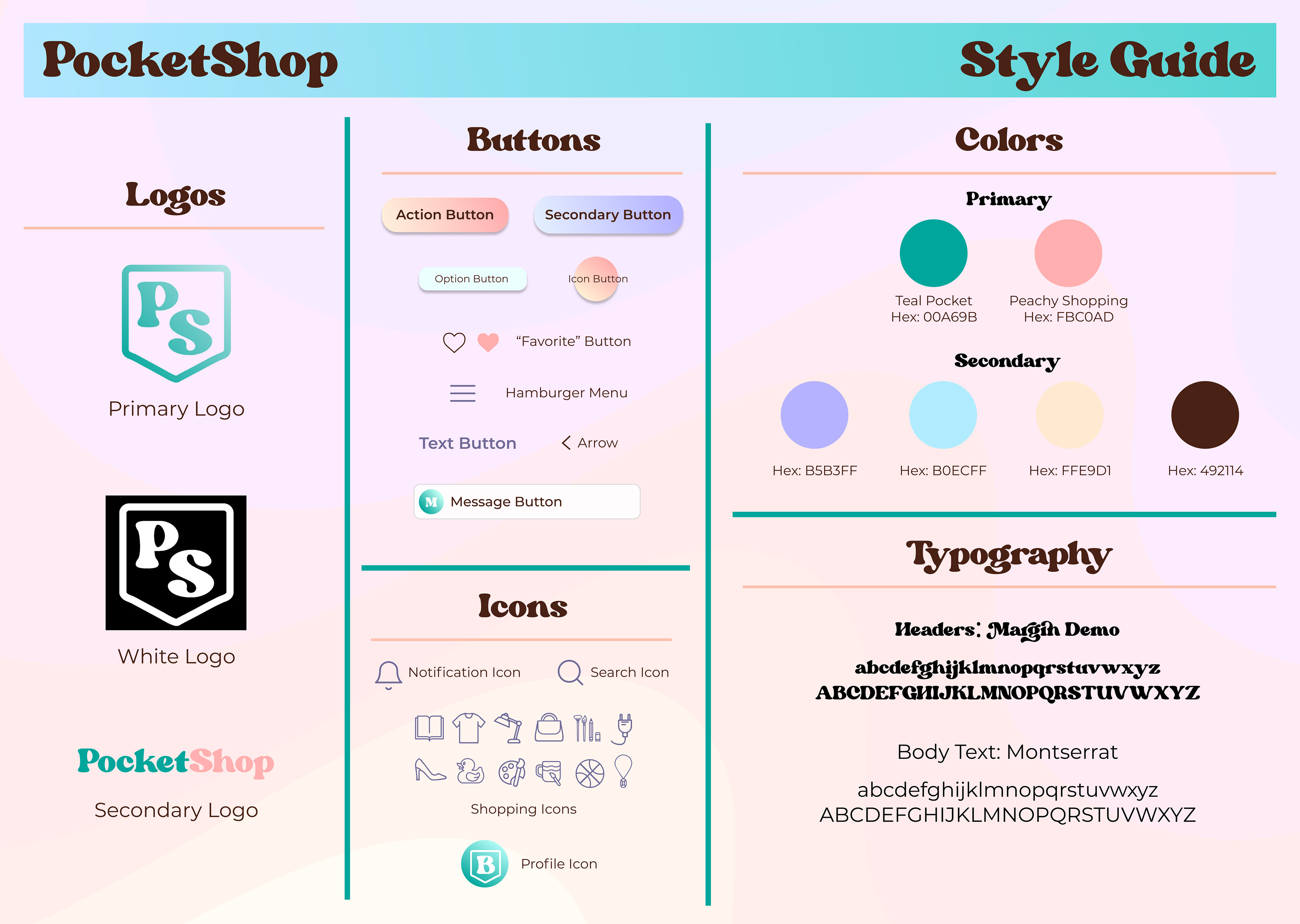
I took what I learned from my user testing and made any necessary changes to my wireframes. As I made those changes, I began to work on the actual design on the app. I came up with some brand attributes I wanted it to have, like playful, dynamic, and groovy. Those attributes helped me develop a cohesive brand identity that I organized into a style guide.
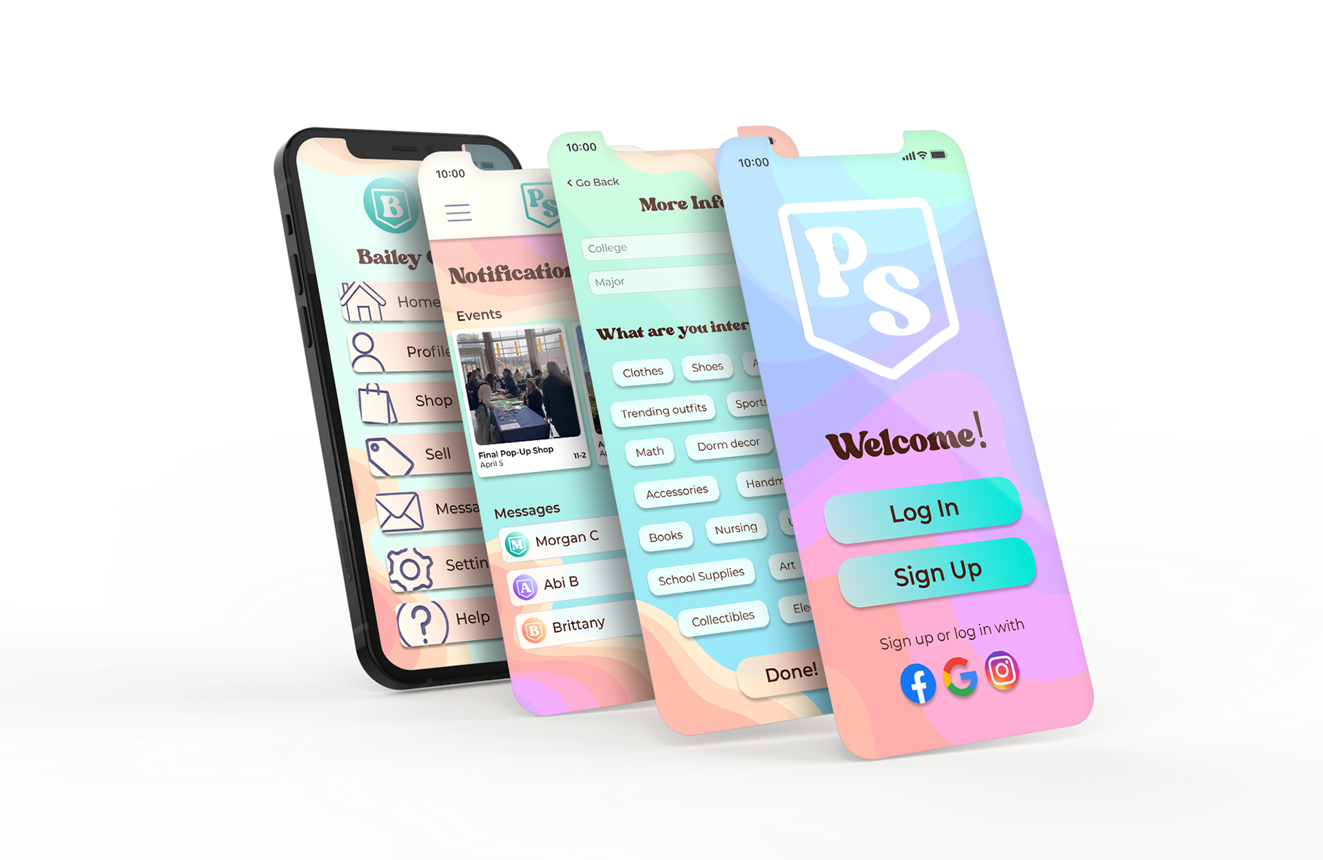
Once I had a style, the app was brought to life.